|
|
I heard that you want to learn more about graphs. Graphs can help us organize two kinds of information that are related, like "what color?" and "how many?" This is called a "graphic" way to show information.
You remember the "pie" chart that Matasaburou showed you, yes? What do you think it would look like if we split it between two of the slices and unwrapped the outside into a straight line?
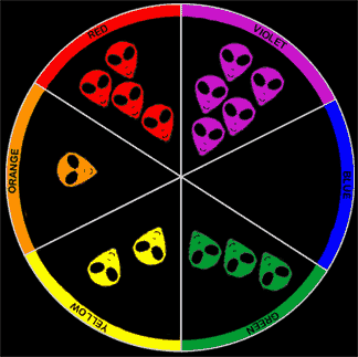 |
I've split it between the red and violet slices to make the new graph below.
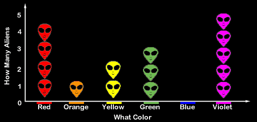
The line that goes from left to right across the bottom of the page is the
x-axis. The x-axis tells us what colors
the aliens are. The line that goes up and down at the left hand side
of the graph is the y-axis. The y-axis tells us how many aliens there are of each color.
The arrows at the ends of the lines mean that the lines could go on
further, but we don't need any more values to graph this group of
aliens.
After looking at the graph, please answer these questions in your notebook.
Which color has the least number of aliens?
Which has the most?
Does this graph tell you the same things that the color wheel did?
How is it different?
What information can you read on the graph that the color wheel didn't have? (Hint: does it have any more words or numbers?)
I'll be you'd make a fine astronomer. Now you are ready to try out sorting some
things to make a graph of your own.