SEGway
home > for educators
> sun-earth
> about
Sunspots >background II
SUNSPOTS
Lesson Plan Resource Guide
Background Material: Research
Activity
Please be sure to read all the
lesson pages, as they provide background for the research activity. Open the
folder SUNSPOTS to start the lesson, and use the navigation links at upper right
to access all sections.
Activity
Read these lesson pages by
selecting the "ACTIVITY" tab near the upper right corner of the
screen.
Scientists compare images taken in
different wavelengths of light and try to find relationships between the
images. They look for correlations
that may point to physical relationships and processes that were previously
unknown. Visible light images of the sun show sunspots on the photosphere,
while x-ray images show us x-ray active
regions in the corona.
Scientists would like to know more
about whether and how the x-ray active regions are connected to sunspots.
Finding a correlation between their respective areas on the solar disk would be
evidence suggesting a physical connection; for example, possibly the x-rays are
emitted by coronal plasma interacting with the magnetic field loops that
terminate in the sunspots. However, this may be difficult to investigate,
even with the latest data. Imagine trying to establish a correlation
between the size of a flame and the size of a burning match tip on a rotating
sphere, especially if conditions like the air around the flame are not constant.
In this analogy, the flame is like the x-ray active areas; the match tip
corresponds to the sunspots seen in visible light images.
In our interviews on this project,
solar scientist George Fisher suggested the
idea of trying to measure and quantify the relationship between sunspots and
x-ray activity. It is commonly assumed among scientists that the hot
active regions in coronal images and visible sunspots are somehow two views of
the same structure, but Fisher believes no one has yet established the
connection with a formal investigation. If the correlation were well
established, and especially if it could be well quantified, this would be a very
useful tool for inferring levels of x-ray activity from older, visible light
images. The Yohkoh satellite produces daily images in both visible and
x-ray light which can be compared over a number of days to address this
question, so a Java "applet" program was written to measure the areas
and plot the data. (The term applet is a diminutive form of
"application.")
The QuickTime movies in
the first page (activity.html) show
the sun over a period of about 2 months, as a series of images in soft
(relatively low-energy) x-rays on the left, and in visible light on the
right. The sun makes a complete rotation about every 28 days. You
may notice that the x-ray areas seem to change rapidly in brightness, this may
be partly due to a "beacon" effect, dependent on whether the hot
region, which may be at some altitude above the solar surface, is rotated toward
the satellite's telescope. The interview with George Fisher presents the
correlation problem in terms of several quantities, which he thinks are
likely to be correlated, and possibly proportional: sunspot area, magnetic
flux, and x-ray energy emitted.
NOTE: if you do not have QuickTime, the same movie sequences appear in
the RealMedia interview clip.
The Java applet program
is launched from the second page, activity2.html.
Activity2 also serves as a self-contained "quick-start" guide
for using the applet. Three more pages of supporting material, can be accessed
from links in the sidebars of pages 2 and 3. These pages are also
displayed sequentially if one continues to use the "next" arrows at
the top and bottom of each page. These links are shown, and the page contents
summarized briefly in the table below.
 |
Page 3 gives a detailed
account of how to operate the applet. This is important for students
who are less experienced computer users, or otherwise have a hard time
starting. |
 |
Page 4 describes how the data
are gathered using the Soft X-ray Telescope (SXT) aboard the Yohkoh
satellite and how the images are created. Supplementary material. |
 |
Page 5 gives detailed
descriptions of what the features in the x-ray images show, as
interpreted by scientists. This information is important for
standardizing the measurements from one student or group to another,
and for understanding what areas seem most likely to be related to
sunspots. |
Students should be urged to
use these pages, as the information will help them make better decisions about
their experimental procedure in measuring the images. Having the applet in a
separate window allows students to keep navigating through the pages of
supporting material as they work.
The Java applet program is a
tool for comparing sunspot and x-ray active areas using the image pixels
as your unit of measurement. Each pixel represents an area roughly the size of
the earth superimposed on the surface of the Sun. Here are some tips that
may be helpful:
- Practice using the applet yourself
before guiding students.
- The applet loads in a separate
window and may require patience with some older machines.
- The applet has data loaded as pairs
of daily images in a single list. Both the visible and an x-ray image
for each date must be measured to plot a point.
- Students will paint over
sunspots and active x-ray regions to measure sunspot or x-ray active area.
This may require "erasing" as well as painting, and using various
brush sizes. Pixels will be quite small on screens with a resolution greater
than 800 x 600 pixels.
- The number that appears in the
display is the number of pixels painted. Students should also keep their own
records of area measurements.
- Any time an image is reloaded,
its previous measurement is erased. This is fine while perfecting
measuring technique, but if students want to review which areas they painted
in a previous image, they should take care not to lose the data.
- After reloading an image, data can
be restored to the values table by referring to written records and
repainting the same number of pixels in the image.
- View measured values by clicking the
"values" button. This is the best way to see quickly
which measurements have been done.
- The program plots x-ray areas on the
vertical and sunspot areas on the horizontal axis. Examine to plot to see
whether the data points suggest a line or simple curve. An obvious graphical
relation is a signature of correlation, which would suggest the two
quantities are physically connected.
- Ruled and labeled graph sheets are
provided for hand plotting the points if this is desired:
X-ray vs. Sunspot area
The x-ray images used come from
the Yohkoh satellite's Soft X-ray Telescope (SXT). Visible (white) light images
are from a camera, also on Yohkoh. Colors are consistent over the data set. For
example, a pixel with 100 photon counts is the same color in every one of the
x-ray images. All images are from a solar maximum (January, 1992), and so
are similar to what the sun may look like as we approach a new maximum in the
year 2000. Current daily images are available at:
http://solar.physics.montana.edu/YPOP/ProjectionRoom/latest.html (goes to Yohkoh SXT site)
Not all features in the X-ray
images are "active regions" for our purposes. Like the
shades of gray in a medical x-ray film, the colors in the x-ray images represent
varying levels of non-visible x-ray emissions. Large spots in
white-to-bright-yellow that are completely within the disk are active regions.
They can be much larger than the visible sunspots and may vary in brightness and
color as they rotate across the disk. Tiny bright spots of 1 or 2 pixels are not
showing the same kind of activity as the larger regions, and shouldn't be
counted. Areas extending outside the disk shouldn't be counted, because they
would be connected to sunspots that have rotated to the edge of the visible
disk, and don't show in visible images. Students may want to study the
QuickTime movie on page activity5.html
to get a better idea of the dynamic changes of the x-ray active areas from
day to day .
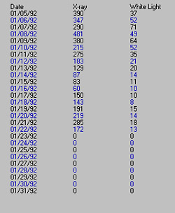
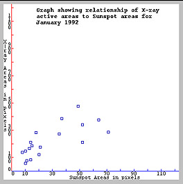
Examples of values and a plot generated
by a teacher using the Java applet are shown below. The plot indicates a roughly
linear correlation. Each point in the plot shows white light area vs. areas of
intense x-ray activity. Although the scatter of the points looks bi-
or even tri-modal (3 different slopes), the plot has a consistent average slope,
with about the same number of points falling above and below a central
line. Since the scale of the x-ray axis is an order of magnitude (x10)
greater than the sunspot axis, the degree of vertical scatter is not too
surprising. The sample and graph also appear in pages activity 2 and activity
3. These are meant as a rough guide only. Students should not be saddled
with the idea that their data should look just like the sample; every
researcher's measurements will be a little different.
Linear Correlation is the
simplest case of what students
may find. This seems to be the case in our example plot, where the points with
x=sunspot area and y=x-ray area seem to cluster about a line with a definite
slope. The relationship between the two quantities might also be expressed in an
algebraic expression, like the linear equation y = mx + b, where x
= sunspot area, y = x-ray area, and b = y intercept (value
of y at x = 0). If
| y
intercept b = 0 |
the slope m
= y/x |
| y
intercept b > 0 |
the slope m = ( y
- b)/x may be positive or negative |
| y
intercept b < 0 |
the slope m = ( y
- b)/x m must be positive.* |
*However, this implies that some
negative values of y correspond to positive values of x, which
signals a non-physical situation, since area cannot be negative. Some
unknown quantity is probably not taken into account; systematic error is the
most likely.
If b = ±0, the
slope m is the factor by which the x-ray area is proportional to the
sunspot area, and m is approximated by the average of y/x for all the points
measured: 1/n i=1Sn
yi/xi. Note
also that the slope is then without units, as it should be, since both x and y
are in units of pixels and these cancel out when divided. You may wish to
have students perform a least squares fit to a straight line, if calculators or
a computer program are available for this.
Note also that time does not appear
as one of the variables in the correlation
plot. These relationships do not depend on the passage of time; it is assumed
that if the (sunspots vs. x-ray active area) correlation exists, it is time
invariant. The absence of a time axis may disorient students who have not done
much graphing. If your students need to approach the goal of the research
activity more slowly, start with plotting the areas measured on the images
against time.
Plotting sheets are included for
graphing each of the white light and x-ray data sets against time:
Sunspot area vs. date ; X-ray
active area vs. date. Horizontal time axes span the month of January 1992,
and vertical axes have appropriate scales for the two types of images. The time
graphs will have some shape, not necessarily linear or smoothly curved-- they
may have sudden jumps as spots and x-ray areas appear and disappear because of
the sun's rotation, or as active areas become brighter and dimmer. Both the
evolution of the sunspots or active regions and the rotation of the sun (once
per 28 days) affects each day's data. For sunspots, the effect of rotation will
likely dominate, as the sunspots evolve on a time-scale of several weeks
or months. X-ray regions may vary on much shorter time scales.
Compare the two time graphs: if
the two graphs show a similar overall shape, comparing them may help students
discover the correlation themselves. The more the shapes are alike, the closer
the correlation graph would be to a straight line. Remember that the vertical
scales of the two time graphs are different, so that a similarity indicates the
x-ray and sunspot areas are proportional, not identical. Encourage students to
make guesses about what the x-ray vs. sunspot graph would look like.
The applet program does not "do
science" by itself. Students must learn how to use the program
correctly and a great deal of the benefit of this activity lies in the critical
thinking required to interpret the images, and make an intelligent
interpretation of the resulting graphs, with some accounting for sources of
error. Team and class presentations, or discussions, using questions like
those suggested in the lesson plan, are
useful in completing the lesson.
- Each student or team should
know which images they are measuring and why.
- They should use good
scientific practices like setting and following consistent standards in
making measurements.
- They should keep their own data
records in a notebook, or on the datalog.html sheets
provided; each time an image is loaded, any previous measurement is
erased.
- They should learn to troubleshoot
their own processes, for example: checking that the number of points on the
plot reflects the number of pairs of images measured.
- The program plots a point for each
PAIR of images measured, IF both the measurements are within the limits of
the plot area
- Finally, if enough measurements have
been done, it may be fruitful to try averaging several team's work together,
to see whether the form of the correlation graph from the average values is
less scattered.
©Copyright 2001 Regents of the University of California.